Open-Xchange
Brand Style Guide
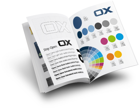
The Open-Xchange brand is well known and for this reason we have published the following summary of the Brand Style Guide to help keep it safe. This should be referred to by anyone working with any Open-Xchange Corporate Design elements, in any medium.
The following sections briefly describe how to, and how not to, use branding features such as the Open-Xchange logo, colors and typography. If you still have questions after reading this, please feel free to contact Open-Xchange Marketing Team for more information or help.


Open-Xchange Logo
Our logo is the cornerstone of our brand. It represents how we operate and how we make our mark on the world. The "O" stands for "Open" and "X," for "Xchange". This relates directly to our mission to open up the world and provide ‘the’ alternative to controlling platforms, as well as exchange ‘lock-in’ and ‘concentrated power’ for a free and open internet.
Open-Xchange Logo with claim
Sometimes two letters need some embellishment. We strongly encourage the use of the logo with the brand claim, whenever possible.
The statement “Stay Open” refers to Open-Xchange’s past history, current working practices and a desire for an internet that is open, safe and free.


Open-Xchange Logo for web
Different media requires different rules. This is simply because you have more control over layout in some formats and less control in others. Also layout looks different in different media. When using the Open-Xchange logo, with the brand claim, this simple rule applies: the claim is positioned to the right on web-based content, and the claim is positioned to the left in print media.
Open-Xchange
Corporate Colors
Colors make things stand out but precision defines a brand.
Open-Xchange has adopted a wide color palette, ranging from blues through greens to oranges, but without rules and guidelines this can lead to some unpleasant results.

Open-Xchange Color Distribution
As shown below the Open-Xchange color palette is based primarily on a range of blues. The second most dominant color group is grey and black tones. This is then followed by the Open-Xchange highlight colors: ice blue, lime green, raspberry, mandarin and mango.
Please note that the use of the highlight colors mandarin and mango should be restricted. They should only be used when all the other highlight colors (ice blue, lime green and raspberry) have already been used.

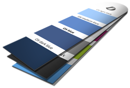
OX Blues
Usage:
-
OX Blue - Used for the Open-Xchange logo when on a white background
-
OX Dark Blue - Used for general backgrounds
-
OX Medium Blue - Used for generating the spotlight on “OX Dark Blue”
-
OX Light Blue - Used for product names
If there is a need to highlight some text in blue, please do not use any of the Open-Xchange blues above. Instead, please use OX Ice Blue from the list of Open-Xchange highlight colors below. OX Ice Blue has been specifically created for this purpose.

OX Blue
RGB 40-75-115
# 284b73
CMYK 90-65-30-20
Pantone 647
Sikkens U0.30.30

OX Dark Blue
RGB 5-45-75
# 052d4b
CMYK 100-80-40-40
Pantone 533
Sikkens U2.21.09

OX Medium Blue
RGB 60-115-170
# 3c73aa
CMYK 80-50-15-0
Pantone 653
Sikkens U0.30.40

OX Light Blue
RGB 120-170-210
# 78aad2
CMYK 55-20-0-5
Pantone 652
Sikkens T4.18.59
OX Greys
Usage:
All Open-Xchange greys can be used for backgrounds, gradients, lines and for form fields.
OX Grey and OX Silver can also be used as text colors in specific cases.

OX Graphite Black
RGB 45-45-45
# 2d2d2d
CMYK 0-0-0-90
Pantone black 7
Sikkens ON.00.15

OX Grey
RGB 135-135-135
# 878787
CMYK 0-0-0-60
Pantone Cool grey 10
Sikkens ON.00.40

OX Silver Grey
RGB 220-220-220
# dcdcdc
CMYK 0-0-0-15
Pantone Cool grey 2
Sikkens ON.00.76
OX Highlight Colors
Usage:
As the name suggests, these colors are reserved for highlighting elements. This important job can only be achieved successfully if they are used as sparingly as possible. For example: using them to highlight starbursts, buttons and/or similar elements that warrant a color highlight.
Please note that the use of the highlight colors mandarin and mango should be restricted and only be used when all the other highlight colors (ice blue, lime green and raspberry) have already been used.

OX Raspberry Red
RGB 180-35-105
# b42369
CMYK 25-95-25-10
Pantone 227
Sikkens A0.41.28

OX Lime Green
RGB 150-195-0
# 96c300
CMYK 50-0-100-0
Pantone 376
Sikkens H2.50.60

OX Ice Blue
RGB 0-160-225
# 00a0e1
CMYK 90-20-0-0
Pantone 7461
Sikkens R5.52.49

OX Mandarin
RGB 230-110-0
# e66e00
CMYK 5-65-100-0
Pantone 166
Sikkens D5.63.53

OX Mango
RGB 250-185-0
# fab900
CMYK 0-30-100-0
Pantone 7409
Sikkens F2.70.65
OX Text Colors
Usage:
The use of black on light backgrounds or the use of white on dark backgrounds is equally effective, but remember that white can also be used as a spotlight color in the silver gradient or as a form field on a light background.

Black
RGB 0-0-0-0
# 000000
CMYK 0-0-0-100
Pantone Process black
Sikkens ON.00.10

White
RGB 255-255-255
# ffffff
CMYK 0-0-0-0

Extra Text Colors
OX Ice Blue, OX Grey and OX Silver Grey can be used as extra text colors in specific cases
OX Gradients
Usage:
Radial gradients can be used to focus attention on something. Like a spotlight behind an isolated visual a radial gradient attracts the viewer’s attention. It can also be used to emphasize a piece of text or a headline. Finally it can be used to simply make a flat background more appealing.
The creation of gradients, and their placement, is quite simple, once you know how. Simply use the pure Open-Xchange colors for each side in the gradient tool and you are done (e.g. OX Dark Blue and OX Medium Blue to create the OX Blue Gradient).
Open-Xchange Typography
Even our corporate font stays open.
With the name "Open-Xchange" and the brand claim "Stay Open" our font must be equally open, at least in name: ‘Open Sans’.
Open-Xchange Corporate Font
Open Sans is a sans serif typeface designed by Steve Matteson. Open Sans has an upright stress and a neutral, yet friendly appearance. It was optimized for print, web, and mobile interfaces, and has excellent legibility characteristics.
We use four selected types of Open Sans and their Italic versions. This allows us to comfortably tackle anything using this font.

.png) Get your slice of the App Pie
Get your slice of the App Pie
OX App Suite.png) What our Partners say
What our Partners say.png) Take a Test Drive
Take a Test Drive
Font Usage
Using a narrow style in combination with bold is a very good way to make things standout. Also by using Open Sans Extrabold within an important statement, or headline, that is in Open Sans Light really makes it ‘pop’. See examples on the left.


